Introducing Monobloc, a Bold and Slick Portfolio Tumblr Theme
Thousands of creatives from all fields use Tumblr today as a platform to showcase their latest creations. Tumblr’s ubiquity makes it easy to build a following and expose your work to potential clients and associates worldwide. As part of our growing collection of portfolio themes for Tumblr, we present you Monobloc—a bold portfolio solution that puts your work front and center.
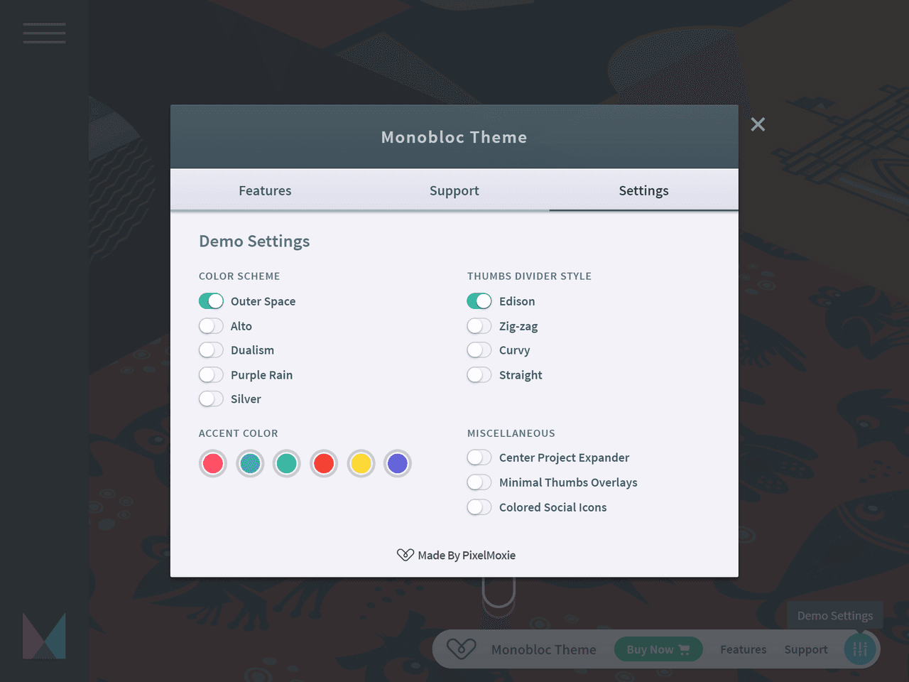
In this post, we’ll show you some of Monobloc brightest features. To see it in action, go ahead and check out the demo. The interactive demo has a widget that lets you preview a selection of the theme customization options—make sure to have a play with it!
Looks dashing on your phone, not just the big screen
Most visitors will be arriving from their phones these days, so we made Monobloc not just mobile-friendly, but mobile-first. Sharp looks on all screen sizes, easy to navigate, extensive use of Ajax functionality so browsing through projects becomes a breeze, are just some of the features that will make your artwork shine forth on any device and available to millions anywhere.
Built-in color schemes
Need to set the mood in a squeeze? Monobloc ships with a selection of built-in color schemes to give your site a makeover without diving into dozens of settings. Alongside the options to set custom accent and link colors, this may be all you need to personalize your website.
The included palettes are called Outer Space, Alto, Dualism, Purple Rain, and Silver. We love dark-themed portfolio sites that make the artwork pop, and we love purple, so Outer Space and Purple Rain are our favorites. Go ahead, play with the Color Scheme options on the Demo Settings and check them out yourself.
Complete control of your hues
While the included color schemes look great and can be a real time-saver, sometimes you want complete control over the color of each element on your website to truly bring it to life and let its personality shine through.
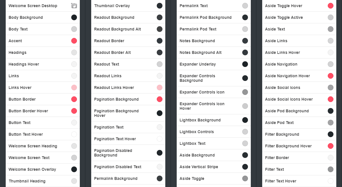
With Monobloc you have the tools. You can keep the selected color palette and change only the link and accent colors, or you can override the color scheme completely. There are over seventy settings available so you can modify the color of almost everything on your screen, including the default and hover states of most links, buttons, and interactive elements.
Your grid, your way
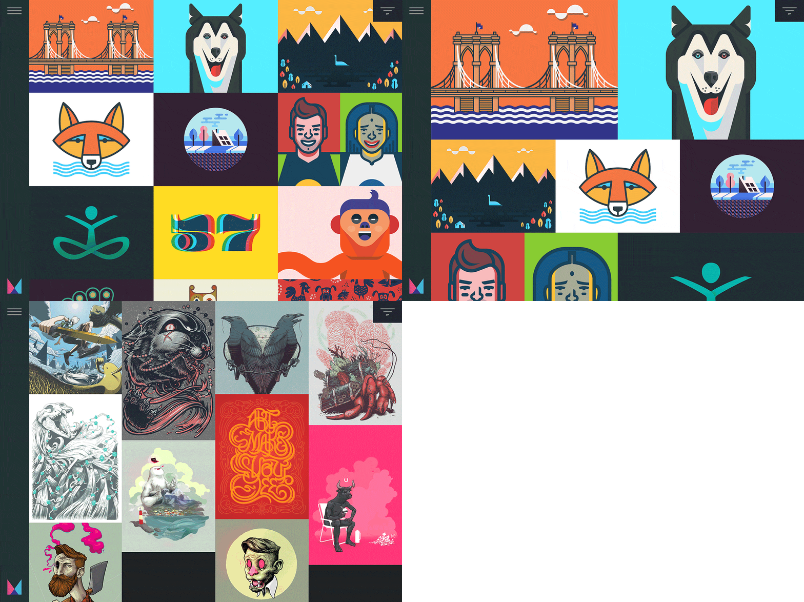
We know how important is to present your artwork in the best possible way. With Monobloc’s flexible portfolio grid, now you have choices. Want to make your thumbnails really tall or extra wide? You got it (and there’s room for squares too.) Fancy a single column on phones, two on tablets, and maybe 3 or 4 on larger screens? You get to decide.
Monobloc gives you two special grid layout types. Segmented Rows is fashioned after Tumblr’s photoset grids: each row can have a different number of thumbnails. Perhaps a single, huge image, followed by a row of two and another one of three? Done. And the Masonry layout lets you have thumbnails of different proportion cascading down the page, filling the gaps.
Embellish a little bit, or just be minimal
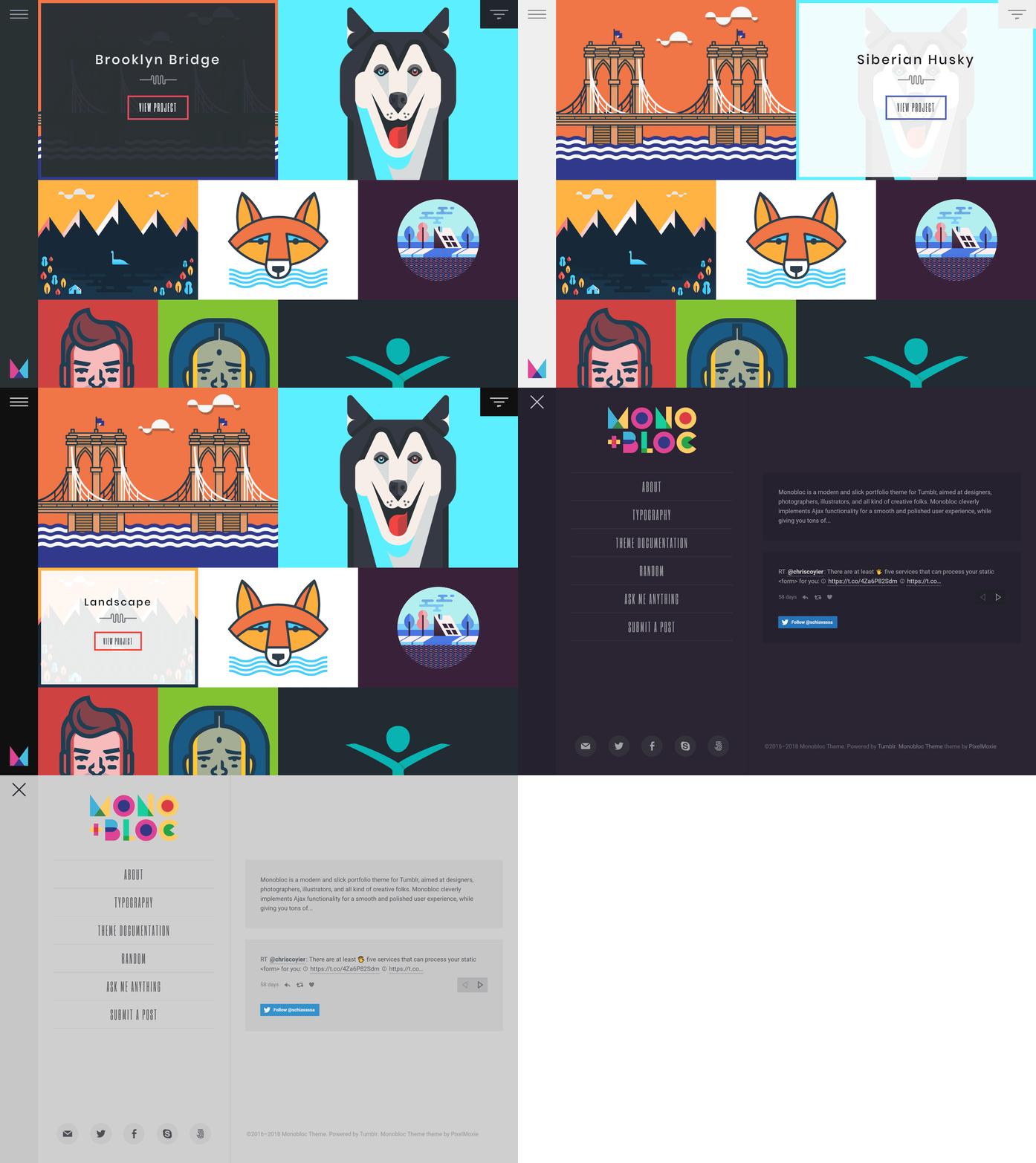
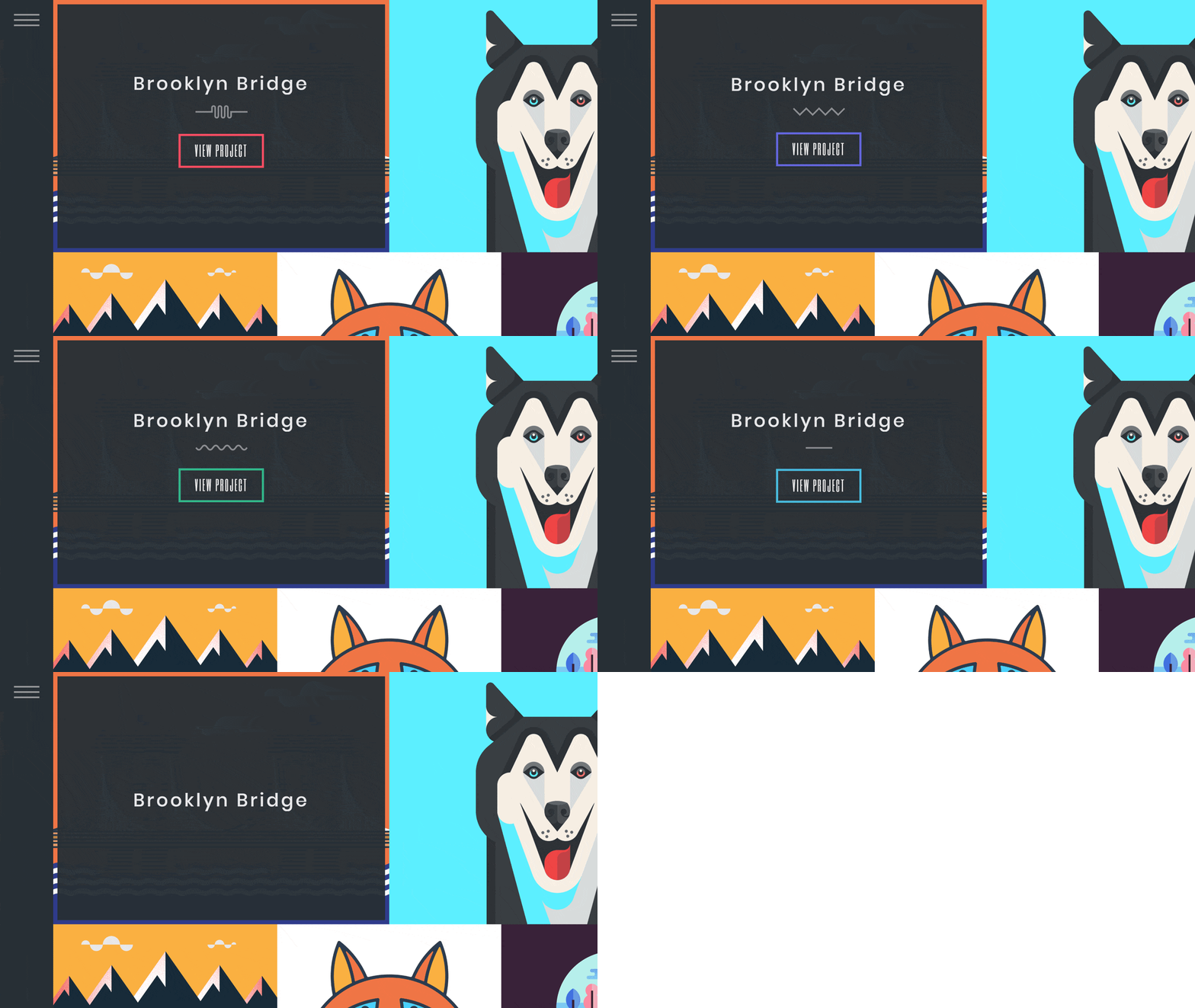
Customize your image thumbnails with different divider styles. Capitalize their text, set up their buttons, or choose a minimal style with just the titles for an uncluttered portfolio grid.
Get yourself expanded
Keeping your visitors engaged is as important as getting them to visit in the first place. Monobloc’s Ajax-powered portfolio expander makes sure no one gets distracted. It’s a beautifully designed project showcase that sits on top of the main grid, making going back just one click or tap away. Without reloading the page, your followers get a detailed look at your work. They will be able to comment, share, and browse the rest of your work—or simply bask in the awesomeness of your talent!
Filter it, baby
Harness the power of Tumblr’s tagging system and let everyone decide what aspect of your work they want to focus on. Monobloc’s portfolio filter is a sticky little fella. It stays put along the top edge of your screen, so getting exactly what you want is just a click or tap away.
A sidebar to rule them all
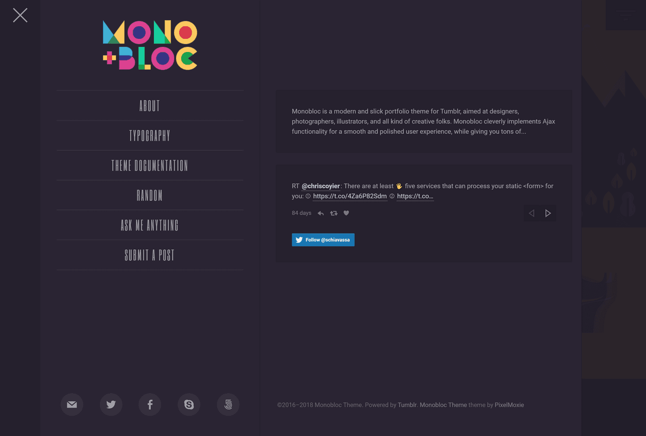
Monobloc’s off-canvas sidebar stays hidden until you really, really need it—giving your work, the main star, the space that it needs to shine. This powerful aside houses your site navigation and description, your Twitter feed, and all the social icons you need to make it easy for your customers to connect to your social media accounts.
Share it everywhere
Social media is your friend when it comes to expanding your reach and growing your customer base. It’s an avenue for communication and trust-building. It allows you to cement your brand and offers you countless marketing opportunities. Through social media, you can reach your customers wherever they are.
Monobloc supports social icons for Facebook, Twitter, Google+, Pinterest, Instagram, Dribbble, Behance, Medium, LinkedIn, Tumblr, Vimeo, YouTube, and many more, making it very convenient for your fan base to connect to your social media accounts.
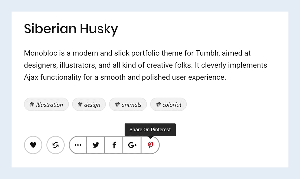
The expandable widget under each post on the project expander lets users like and reblog your posts on Tumblr, and the social sharing buttons make it easy to share your work on social networks.
With these features, followers can eagerly share their favorite works of yours with their friends and family.
Wait, there’s more!
Monobloc also comes packed with a full-size Welcome Screen, Supercharged Photosets with different display modes (photoset grid, stacked images, or image slider), Ajax pagination options for seamlessly loading your posts… we could go on and on about this amazing Tumblr theme!
Check out the interactive demo, play with the customization settings, load it on your mobile device, and don’t forget to share it with your colleagues and friends!
